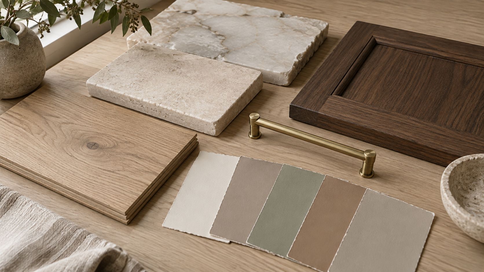
The best whole-house color palette starts with the things you can't repaint: floors, stone, wood and brick. Pick two or three wall colors that share an undertone with those finishes, carry them through the main rooms, and save stronger color for smaller rooms you pass through, not live in.
In our studio, color is part of design, not a last-week decision. A house that reads as one calm piece usually got there because someone chose the materials and the paint together, room by room, in the light each room actually gets.
Key Takeaways
- Start with fixed finishes (flooring, countertops, stone, cabinetry wood) and choose paint to suit them, never the reverse.
- Match undertones. Warm with warm, cool with cool. Mismatched undertones are why a 'neutral' can look dirty next to a floor.
- Use a small family of colors: one main wall color, one or two related shades, and one accent.
- Every open sightline should show colors that belong together. Closed rooms can go further.
- Test large samples on the wall and look at them morning, noon and night before deciding.
Start With What You Can't Repaint
Paint costs little and changes in a weekend. A white oak floor, a quartzite island or a limestone fireplace wall is there for decades. So the palette starts with those. Lay the real samples side by side on a table: flooring, counter slab, cabinet stain, tile, hardware finish. That little pile is the true color scheme of the house.
Then look for the undertone each one carries. Oak leans yellow or pink. Many marbles lean gray-blue. Travertine and limestone lean cream. Your wall colors should sit comfortably inside that family instead of fighting it.

Undertones: The Part Everyone Skips
Two beiges can look identical on a paint chip and completely different on a wall. The difference is undertone, the hidden hint of yellow, pink, green or blue underneath. Put a chip against pure white printer paper and the undertone shows up fast.
Warm or cool, then stay there
The warm neutrals popular right now, creamy whites, mushroom, clay, soft sage, pair well with wood floors and natural stone. Cool grays pair with blue-veined marble and black steel. Mixing a cool gray wall with a honey-toned floor is the most common reason a room feels slightly off without anyone knowing why.
Build a Family, Not a Collection
Most well-colored houses use fewer colors than people expect. We usually think in three layers:
- The main wall color. It runs through the entry, halls, kitchen and living spaces, anywhere rooms open into each other.
- Related shades. One or two colors from the same family, a step darker or lighter, for bedrooms, the study or a dining room.
- One accent. A deeper, more saturated color used in small doses: a powder room, a library, the back of built-in shelves, a front door.
Trim and ceilings are part of the palette too. A slightly softened white on trim and a ceiling tinted a shade lighter than the walls keeps a room from looking like a white box with a colored lining.
Follow the Sightlines
Stand in the foyer and look around. Every room you can see from there is part of one picture, so those walls need to belong together. Rooms behind doors can take more risk, because you meet them one at a time.
This is why we mark color on the floor plan early. Where two colors meet matters: change color at an inside corner or a cased opening, never halfway down a flat wall, and never where it looks like the painter simply ran out.

Light Changes Everything
The same paint looks different in every room because the light is different. North-facing rooms get cooler, even light that can make grays go flat and blue; a warmer color helps. South and west rooms get strong, warm light that can turn a creamy white yellow by late afternoon; a slightly cooler or grayer white holds up better.
Paint big samples, at least two feet square, on more than one wall, and check them in the morning, at midday and after dark under your actual light fixtures. Warm LED lighting at around 2700K will pull every color warmer at night.
What changes in Houston
Gulf Coast sun is bright and high for much of the year, and west glass takes a hard late-day glare. Pale warm whites can wash out to almost nothing in those rooms, so we often go a half step deeper than clients expect. Big live oaks and green lawns also bounce green light through windows, which is worth knowing before you choose a sage. Outside, the exterior brick, stone and roof color should connect to the entry palette, since you see both at once from the front door.

Frequently Asked Questions
Should every room in the house be the same color?
No. Keep open, connected spaces in one color or one close family so the house feels calm. Closed rooms like bedrooms, a study or a powder room can shift to a related shade or a bolder accent without breaking the flow.
How many paint colors should a whole house have?
Most homes look best with three to five: one main wall color, one or two related shades, one accent, and a trim white. More than that usually starts to feel like separate houses stitched together.
Is gray out?
Cool, flat gray has given way to warmer neutrals, but gray still works when the finishes are cool, like blue-veined marble or dark steel. The rule isn't a trend. It's matching the undertone of what's already in the room.
When should paint colors be chosen in a custom home?
Choose them alongside flooring, stone and cabinetry during design, then confirm with large samples once the drywall is up and the windows are in. That way color and materials are decided together, not forced to match later.
If you're planning a house and want the materials and colors to feel like one idea from the start, start a conversation with the studio.